Measuring Delivery Performance

Earlier this month, I asked teams to complete a survey to begin measuring the four DORA metrics. This post outlines our aggregate results (the median across seven teams), as well as my analysis from that survey.
But first, what are the DORA metrics?
The DevOps Research and Assessment (DORA) group has been measuring software practices for 10 years now across thousands of companies and every industry. One of the key results of their research is what we often refer to as the DORA metrics: four composite measurements that are correlated with software delivery performance. The exciting thing about these metrics for me is that they are backed up by strong data and research rather than opinions, but also that they've found that software delivery performance is a predictor of organizational performance, defined as an organization's ability to achieve its financial and non-financial business goals. You read that right: their research goes beyond correlation into prediction.
Like any good metrics, these are best if used to measure rather than to evaluate or judge. In other words, we won't be using these metrics to reward or punish anyone—they are a tool for us all to learn from and to help guide our work.
2023 results
DORA uses cluster analysis to categorize organizations as low, medium, or high-performing. The following table outlines this clustering, with our results in bold.
| Software delivery performance metric | Low | Medium | High |
|---|---|---|---|
| Deployment frequency | Between once per month and once every 6 months | Between once per week and once per month | On-demand (multiple deploys per day) |
| Lead time for changes | Between one month and six months | Between one week and one month | Between one day and one week |
| Time to restore | Between one week and one month | Between one day and one week | Less than one day |
| Change failure rate | 46%-60% | 16%-30% | 0%-15% |
From this, we can see that we are primarily in the medium performance cluster, which is great news. In fact, when comparing to industry-wide measurements, we are performing better than around 50% of organizations! 🚀
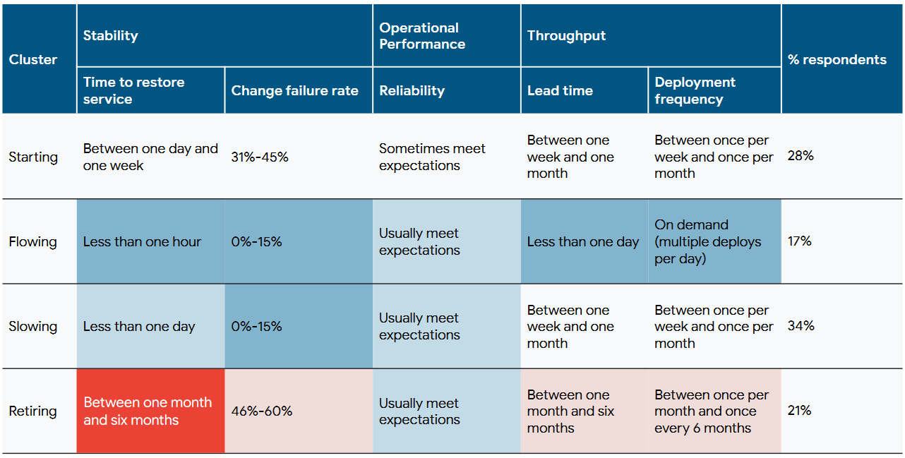
In 2022, DORA did another analysis to find four more clusters: Starting, Flowing, Slowing, and Retiring. Under this analysis, we are squarely within the Slowing cluster. Here's what the report has to say about that cluster:
Respondents in the Slowing cluster do not deploy too often, but when they do, they are likely to succeed. Over a third of responses fall into this cluster, making it the largest and most representative of our sample. This pattern is likely typical (though far from exclusive) to a team that is incrementally improving, but they and their customers are mostly happy with the current state of their application or product.
Deployment frequency
For the primary application or service you work on, how often does your team deploy code to production or release it to end users?
Between once per week and once every six months.


Deployment frequency is one of the simpler metrics of the four to understand at a glance, but one of the more difficult metrics to move because it requires a lot of automation and a lot of trust.
Our result was between two options: "between once per week and once per month" and "between once per month and once every six months," so I've merged them here rather than rounding up or down.
This puts us in the medium to medium-low performance range according to the 2022 state of DevOps survey, making it the metric where we're most behind the industry average. I believe that there are two compounding factors that contribute to this:
- Release friction – when deployments are hard, we're less motivated to do them frequently.
- Release sizing – large releases result in longer time between releases.
Release friction
This friction comes primarily from externalities: the need to coordinate outside the team. These can include hand-offs to get the software into an environment (DevOps does this currently), needing to sync deployments with other teams, or needing to test systems external to the application that's being deployed in order to feel confident about the deployment.
Our current strategy for tackling this is primarily focused on reducing this friction by improving our capabilities around continuous integration, continuous delivery, deployment automation, and test automation. Many of us have already seen the benefits of continuous integration and test automation, and we're hard at work building new environments and infrastructure-as-code (IaC) to support continuous delivery and deployment automation.
Our end-goal is to make the entire delivery pipeline self-serve: each team should be able to independently and reliably build and run their applications or services. In concrete terms, this means teams should be able to run their own delivery pipeline rather than handing things off to QA or DevOps for testing and deployment. In this new world, DevOps will be responsible for building and maintaining the tooling that enables this, but they will not be directly involved in deployments except to support the team or answer questions.
In order to fully achieve this goal, we'll also need to address the tight coupling between teams and applications by improving our capability around loosely-coupled architecture to ensure that we can more reliably test changes with substantial isolation between systems.
Release sizing
When releases are hard, we don't do them often, which results in large releases that are hard to deploy, and so on. It's a cycle that's difficult to break. As we develop the capability to deploy more frequently, we will need to simultaneously develop capabilities around smaller release sizing to consciously break this cycle.
Teams who want to plan for smaller, more incremental releases while building out their delivery pipelines should consider measuring the current state of the following capabilities and discussing how they may improve.
- Work in process limits – this effectively means avoiding working on multiple things at the same time. We do a decent job of this, but we can always improve.
- Working in small batches – we do a great job of this in the planning and build stages, but lose a lot of that benefit by regrouping the work for testing and releasing. Teams who experience this should imagine how they might release work as soon as the ticket is done rather than grouping tickets for larger releases.
- Streamlining change approval – the goal of this is to move away from external approvals by focusing on "peer review during the development process" and automating the detection and correction of errors earlier in the delivery lifecycle. Our CI/CD efforts will make this possible, but we must also begin shifting our trust to those systems or else we won't fully reap their benefits.
- Trunk-based development – committing directly to the "trunk" (the
mainbranch) or regularly merging in very short-lived branches rather than long-lived "feature" branches helps create a discipline of work-in-progress limits and reduces the complexity of merges. Note that this is a bit different than the method that we currently recommend, so teams may want to try piloting this to see how it works for them.
Lead time for changes
For the primary application or service you work on, what is your lead time for changes (that is, how long does it take to go from code committed to code successfully running in production)?
One week to one month.

Lead time for changes is a great metric because it effectively measures our pipeline from create to release, a portion of the lifecycle that includes nearly the whole team rather than just one function. This is helpful since we want to measure performance at the team level, not the functional or individual level.
Responses for this included "one day to one week," "one week to one month," and "one to six months," and proved somewhat difficult for teams to answer. Our median result of "one week to one month" puts us squarely in the medium performance cluster, but still slightly behind the industry average.
This was a notably difficult metric for teams to measure, partly owing to disparate data points. It's easy to see when code was first committed, but it's harder to see when that code first landed on production. Continuing to build our continuous delivery pipeline and automating deployments will help us connect these dots, giving us greater visibility of our code's journey through our pipeline, complete with automatic timestamps of each event.
This is worth noting because it highlights how automating our processes not only improves our delivery performance, it makes it significantly easier to measure. This in turn allows us to take a more measurement- and data-driven stance and strategy toward planning and operating.
Time to restore
For the primary application or service you work on, how long does it generally take to restore service when a service incident or a defect that impacts users occurs (for example, unplanned outage, service impairment)?
Less than one day to one week.

Time to restore is effectively how long it takes to recover from an incident. This was the metric that was closest to the industry average, but many teams also noted that this was difficult to measure accurately.
Reaching the highest level of performance in this metric requires many things, but I want to highlight three relevant items for us:
- An excellent commitment to customer experience to ensure that broken systems are prioritized. I don't know a single team that wouldn't immediately jump on a problem if customers were impacted, so we get an A+ on this 👍. I'd argue this is precisely why our performance is as high as it is for this metric.
- Great monitoring and observability capabilities to give us not only useful insights during active incidents, but also leading indicators so we know when an outage might be about to happen. We could do better here, and should look for opportunities to improve both at the team level and organizationally.
- Having loosely coupled architecture makes it much easier to find the root cause during an incident. By contrast, tightly coupled systems make it incredibly difficult to identify whether an issue is a symptom of another problem, the cause of the problem, or even unrelated to what the customer is experiencing. It's hard to know where the string starts if it's in a big ball of yarn. When I think back on the incidents that took a long time to resolve over the last year, this is most often the reason.
Change failure rate
For the primary application or service you work on, what percentage of changes to production or releases to users result in degraded service (for example, lead to service impairment or service outage) and subsequently require remediation (for example, require a hotfix, rollback, fix forward, patch)?
0%-15%.

By far our highest-performing metric, change failure rate measures how often a release goes wrong. While we had outliers at 16–30% and 31–45%, every other team chose the lowest option of 0%-15%. That puts us in the highest possible bracket for performance. This is really a testament to our planning and testing efforts, so please take a moment to reflect on everything we do to ensure our releases are stable and ready!
An interesting fact about this metric is that it initially didn't "pass all of the statistical tests of validity and reliability" to statistically tie it to software delivery performance1, though it is highly correlated with it. I'll leave it to the reader to imagine what that might mean since DORA isn't apt to jumping to conclusions from their data.